Thanks Martin, I checked again following your suggestions:
- The path bar color
- The focus rectangle
- The selection color
They are all there — but unfortunately, they’re not visually strong enough, at least in real-world use.
For example:
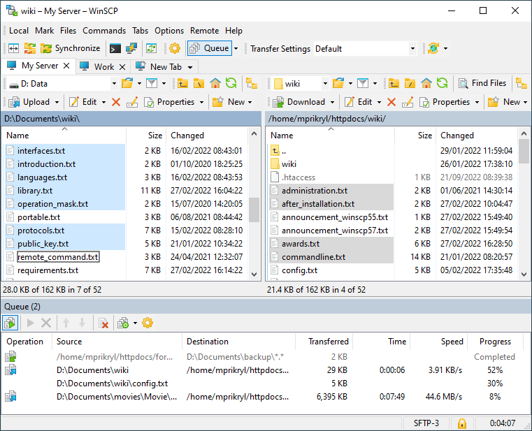
If I minimize and then restore the window, it's very easy to lose track of which panel is active, because the visual difference is too subtle.
The focus rectangle is thin and barely noticeable, especially with modern screens and themes.
Also, in my case, the background color of the local (left) and remote (right) panels looks almost the same. Even when one is active and the other is not, there’s not enough contrast.
Example:
If I set a violet theme and the local panel is active, I still see similar violet tones on both panels — so I can’t easily tell which side is active.
That’s why I wrote here:
I believe this could be improved with a much stronger visual distinction — like a different background color, a more visible border, or even a small indicator/icon showing “active panel”.
Maybe the inactive panel could simply turn gray (dimmed) — like visually "not selected" — and when I click on the other side, it becomes violet or highlighted again.
That’s just an idea, but something like that would really help.
Thanks again for listening!