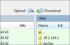
Upload and Download buttons placement
In one of the last updates the toolbars were slightly modified.
All in all I like it but there's one change I am not quite happy with: the "Upload" and "Download" buttons.
In previous versions we had arrows that pointed to the window the file would be transferred to. This was very intuitive, you hadn't have to think in terms of up and down but I also understand why you changed this.
But it's not only about the buttons themselves but also about their placement: the former arrows could be placed side by side in the middle between the windows but now the upload button is far left.
If these two buttons could be placed on a dedicated toolbar (each) the former way of placement would be possible.
A mix of former icons and current button placed side by side could look like this:

Just an idea.
All in all I like it but there's one change I am not quite happy with: the "Upload" and "Download" buttons.
In previous versions we had arrows that pointed to the window the file would be transferred to. This was very intuitive, you hadn't have to think in terms of up and down but I also understand why you changed this.
But it's not only about the buttons themselves but also about their placement: the former arrows could be placed side by side in the middle between the windows but now the upload button is far left.
If these two buttons could be placed on a dedicated toolbar (each) the former way of placement would be possible.
A mix of former icons and current button placed side by side could look like this:

Just an idea.