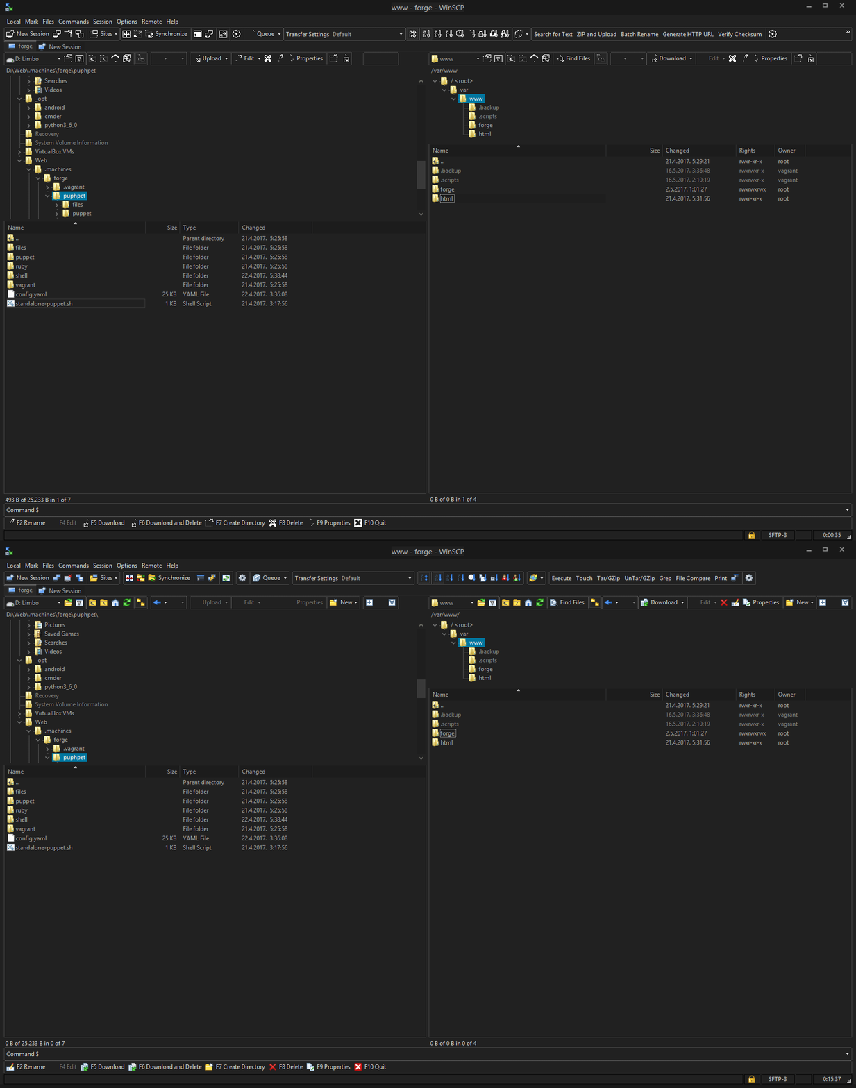
Toolbar icons issue with dark Windows themes
Not exactly a bug, rather a customization issue.
I am using a custom dark theme for Windows 8.1 to reduce eye strain etc. The problem is WinSCP toolbar icons become monochromatic outlines which are barely recognizable (see attached picture).
I suspect this is because WinSCP uses transparent icons (possibly 8-bit which would explain the rough edges) in their normal state to achieve visual consistency with the operating system.
Here is the interesting part. Hovering the icons displays the alternative versions which are displayed fine.
My question: is there something I can do to at least make the icons recognizable? They don't need to be pretty just easy to recognize. I know I could download the source code and compile it myself with potential fixes for the issue but then I would need to do that every time a new build is out.

