Indicator of COPY vs MOVE in transfer queue

Advertisement

guest6481
Joined:
Posts:
12

Indicator of COPY vs MOVE in transfer queue

Versions: 4.1.3 to 6.0.0-20221111

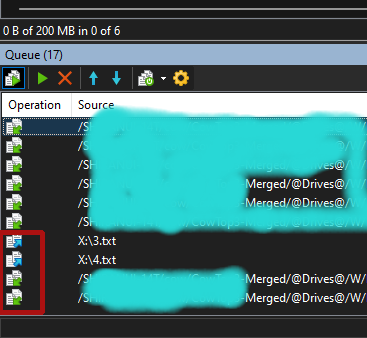
Of the last 4 transfers, which are COPY and which are MOVE? How will you know? If you hit the wrong key (F5 vs F6), how can you tell?

Also, instead of the usual "copy" icon (two pages), could that be changed to something more obvious, like a big UP or DOWN arrow (upload/download)? If you're transferring between 2 *nix or 2 Windows systems, using the paths to guess isn't so intiuitive.
[icon] c:/file.txt                /home/pickle/*.*
seems obvious, I guess.
[icon] /home/pickle/1.txt         /home/apple/*.*
not so obvious (yes, yes, the "*.*" is a hint, but...)

Next, an option to drag re-order the transfer queue items? I'd rather have the percentage at the left.

Lastly, like how you can drag ton change the order, BUT, you can't scroll the list. if you want to move item #30 to #5, you have to STRETCH the queue size and HOPE it fits (or do multiple drag-then-scrolls), or delete items and re-queue in the desired order.
4.png

Reply with quote

Advertisement

martin
Site Admin
martin avatar
Joined:
Posts:
41,440
Location:
Prague, Czechia

Re: Indicator of COPY vs MOVE in transfer queue

  • The icons for Upload, Upload and Delete, Download and Download and Delete are different. Admittedly (particularly in your dark mode), the distinction is not that clear. We will see if more people have problems with this.
  • There are Move Up/Move Down command. You can also use drag&drop. You actually admit that yourself in your next point. Or did I misunderstand?
  • I'll look into the scrolling.

Reply with quote

guest6481

Re: Indicator of COPY vs MOVE in transfer queue

You misunderstood. The icons don't identify which mode: COPY or MOVE visually. They are the same.

Is there anyone online [la chat] where i can find you? this is so difficult for mem to keep typing and screen-shotting things over and over ....

Reply with quote

martin
Site Admin
martin avatar

Re: Indicator of COPY vs MOVE in transfer queue

No they are not the same. On your screenshot, I can see that the 7th, 8th and 9th operations (the first three in the red rectangle) are Copy, and the rest are Move. As on the toolbar, the Move operation is distinguished by the source file icon being blurred. Though I understand that the difference is small. Particularly on the contrasting black background.

Reply with quote

guest6481
Joined:
Posts:
12

Not everyone has your 20/20 vision to stare/squint at that to determine "focus" of the 16x16 graphic on a 1920x1080 monitor.

I have the feeling that I should stop trying here; you want it a certain way, and us handicapped people should just shut up.

I won't post again; I'll just accept losing files on version 4.1.3. At least I have SOME of the options I need. Maybe if I weren't homeless, I would send you $100; I'm sure I'd be taken more seriously then.

Reply with quote

Advertisement

martin
Site Admin
martin avatar

I never wrote that I want it this way. I just wrote that it's not a bug as such, the icons are different. The icons can definitely be improved. But I'm programmer, not a graphics designer. So the change is difficult for me. I cannot "fix" this by code. If I could, I'd do it straight away. But I cannot. I have to hire someone to fix the icons. It's complicated and expensive.

Reply with quote

Advertisement

You can post new topics in this forum