Visual indicator for selected active panel (left or right)?
Hi,
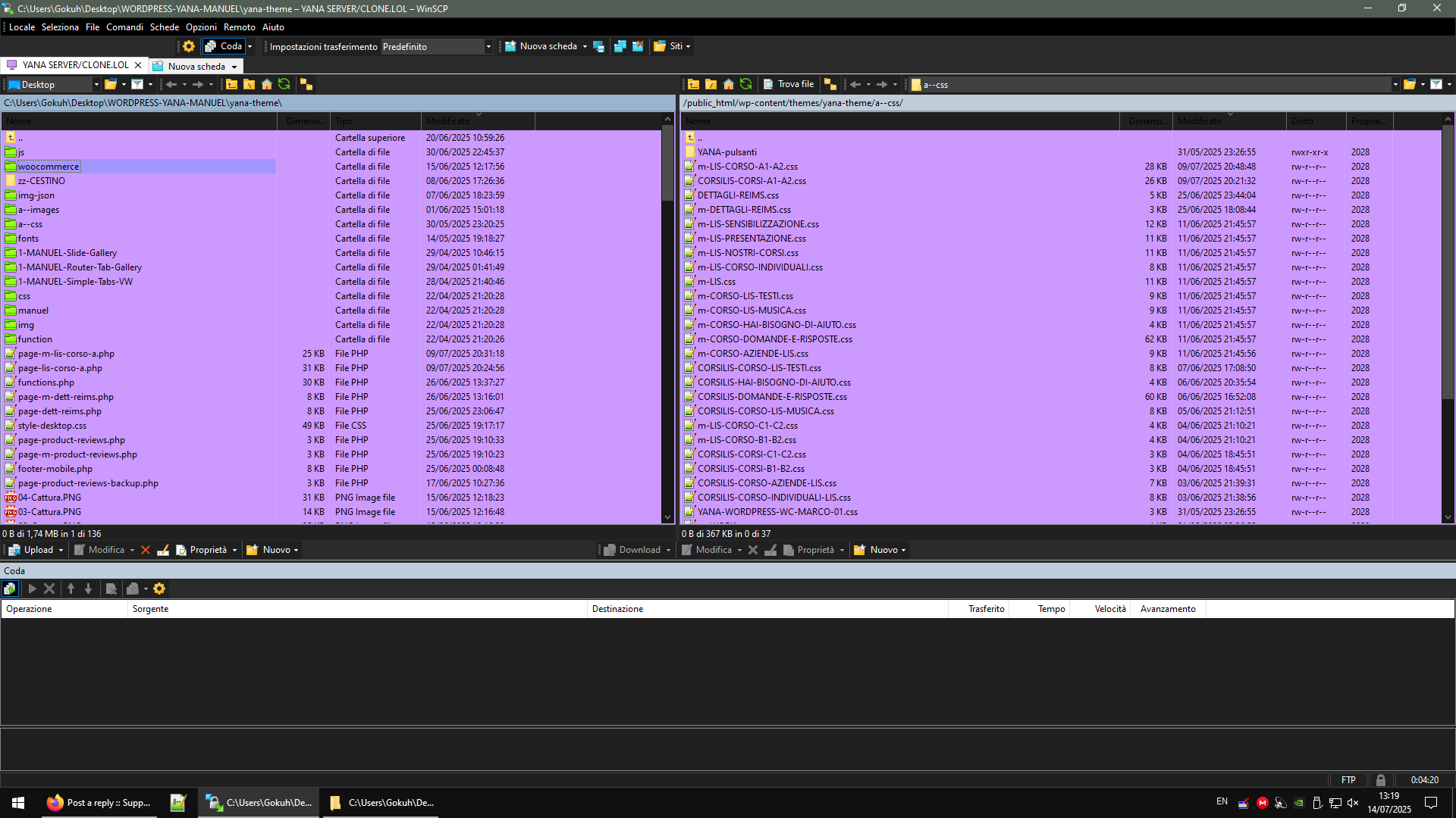
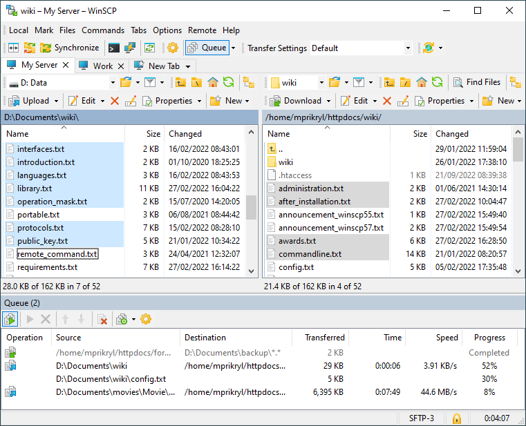
I often work in Commander interface with local files on the left and remote files on the right.
Sometimes I forget which panel (left or right) is currently selected/active — especially after minimizing and restoring the window.
For example, if I press
I would like to suggest a visual indicator:
When one panel is selected (active), it should be clearly highlighted or have a brighter background, and the other panel (inactive) should be slightly dimmed.
This would make the UX much clearer and safer — avoiding wrong transfers due to wrong focus.
Is there any option to enable this, or could it be considered as a feature request?
Thanks!
I often work in Commander interface with local files on the left and remote files on the right.
Sometimes I forget which panel (left or right) is currently selected/active — especially after minimizing and restoring the window.
For example, if I press
F5 to copy, I get confused whether it will upload or download, because I’m not sure which side is active.
I would like to suggest a visual indicator:
When one panel is selected (active), it should be clearly highlighted or have a brighter background, and the other panel (inactive) should be slightly dimmed.
This would make the UX much clearer and safer — avoiding wrong transfers due to wrong focus.
Is there any option to enable this, or could it be considered as a feature request?
Thanks!
